
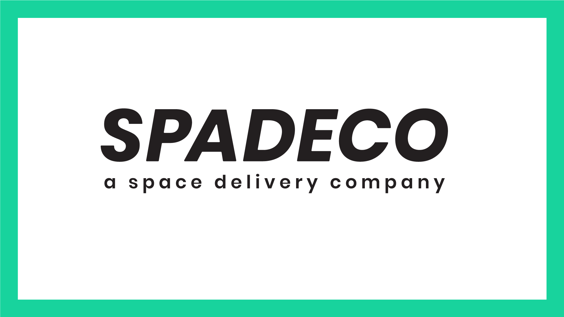
Logotype for the company.
I created this logo and visual identity for a space delivery company called Spadeco. The name for Spadeco comes from the words 'space delivery company'. For the typeface I selected Poppins and customized it a little bit. I created the logo so that could be used in different color combinations, printed on large spacecrafts, embroided on uniforms and even used as a repetitive pattern if wanted.
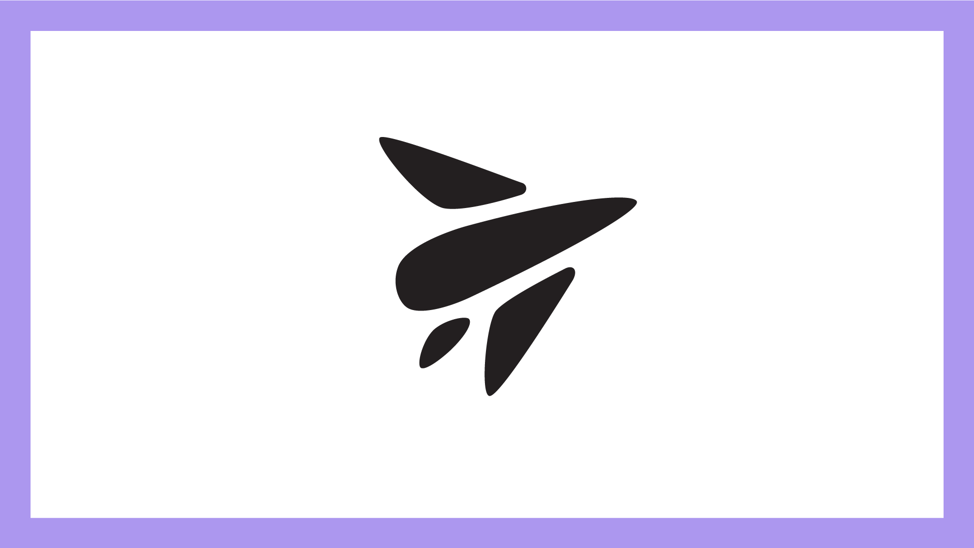
Logomark for the company.
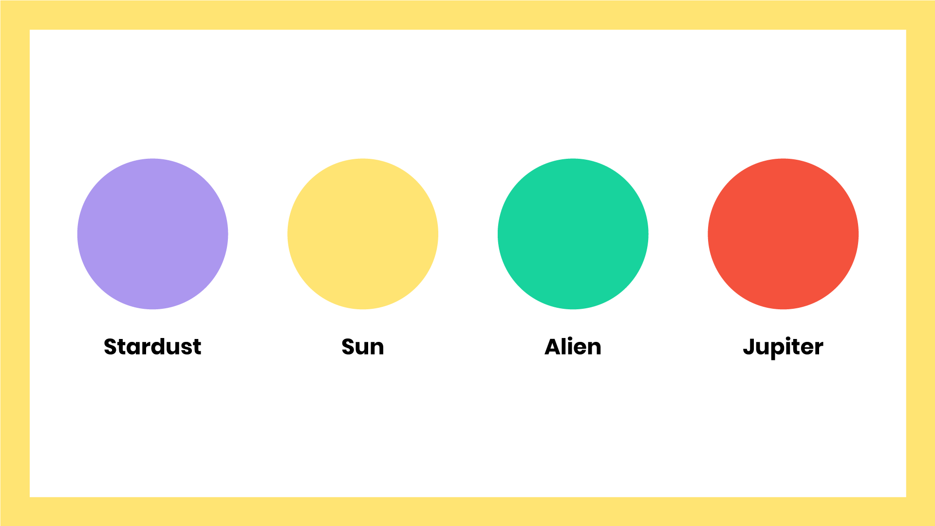
The space cartoon inspired bright color palette.

iOS app icon for the company's app.
The color palette and concept for a space delivery company was inspired by Futurama, the cartoon series. With this project I wanted to select more bright colors for the color palette than what is normally done and make it work. If wanted, also only one or two of the strong colors (for example purple and green) could be selected to be used in the final visual identity along side neutral white, greys and black. Different colors could also be used to indicate different kind of deliveries. For example green for standard delivery, purple for quick delivery and red & yellow for cargo.
I wanted the visual identity to reflect efficiency, fun and easy deliveries. The logo symbol is a simplified stylized spacecraft and it can be used for many purposes including app icon, printed on spacecraft exteriors, business cards and uniforms.

Color variations of the icon and typeface logos.
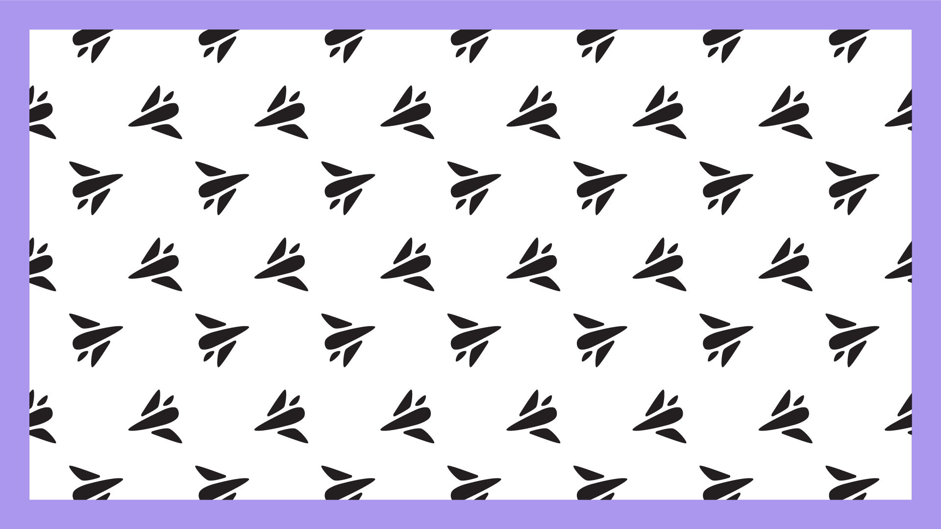
Logo pattern for example for packaging.

Animated logo.