
While working at Heeros, I have had the opportunity to participate in a major brand renewal in 2022. We combined two existing brands into one following a company merger. In 2023, we brought the new branding to life on our website and continued to implement it across all our marketing and internal materials, including guides, brochures, social media ads, rollups, stickers, and more.

Brand implementation and UI layout details on the new Heeros.com website
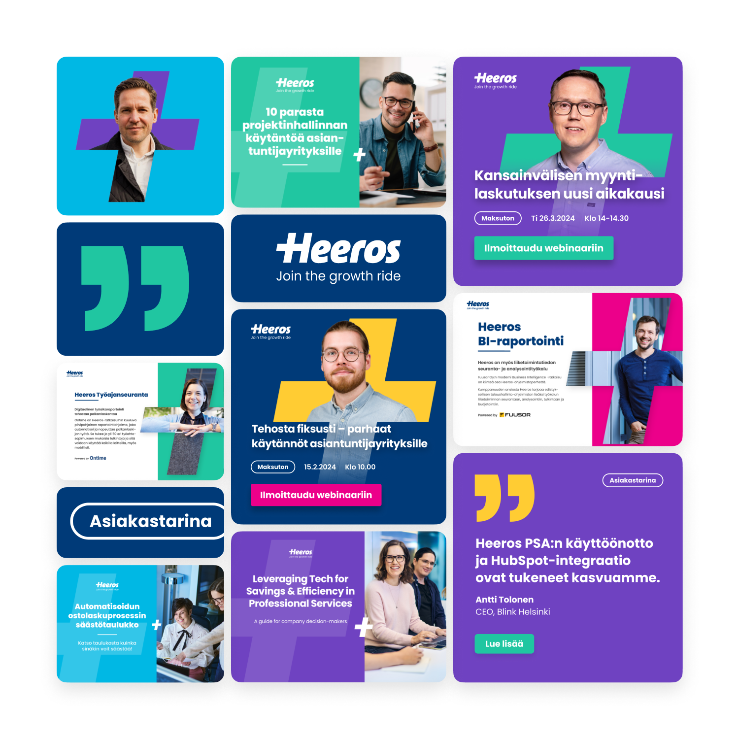
Examples of the brand implemented across materials and platforms. Brochures, ads, email banners, website, social media.
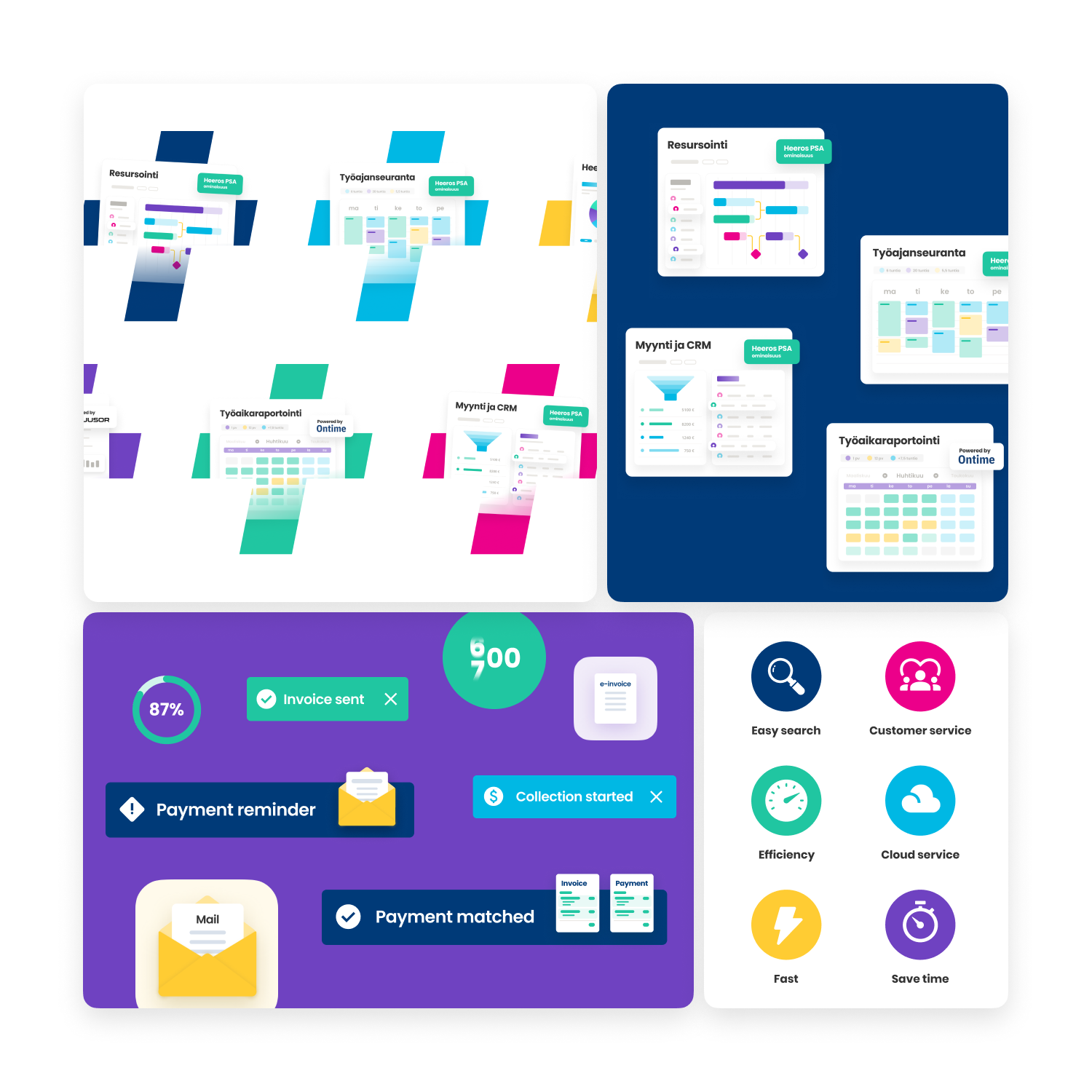
Illustrations and icons used in different visual from the website to ads and demo videos.
For the visual aspect of the brand, we decided to select new brand colors and a new typeface. The logo needed to remain unchanged. Overall, the visual identity became more dynamic and fresh. The color palette was expanded by adding green, purple, and yellow to the existing dark blue, sky blue, and pink. The typeface was changed from Open Sans to Poppins.
A significant visual addition to the refreshed and merged brand was the plus element, which was cut out from the letter H in the Heeros logo. Additionally, the slogan "Join the growth ride" was added to the main logo.
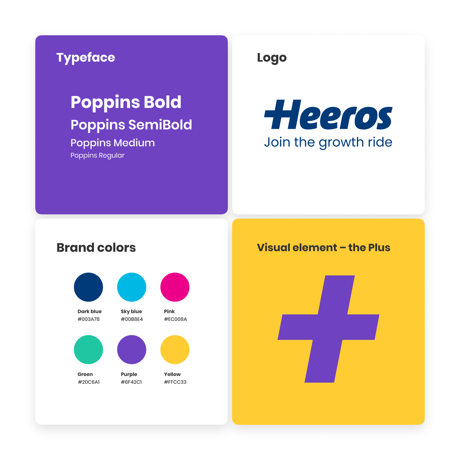
Brand guide

Ads and other assets created for Heeros.
Here are some examples of the Heeros brand in video format. A longer format video (a product overview) available here on Youtube.